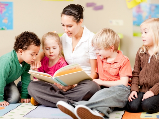
When you walk into a preschool classroom, you notice color before almost anything else.
The walls.
The furniture.
The learning materials.
Before a child hears a teacher’s voice or joins an activity, their brain is already responding to the environment around them. That response matters more than many people realize.
If you’re researching preschools in Tucson, or if you work in early childhood education, understanding how color affects learning helps you look beyond surface-level design. It helps you understand how a space supports focus, emotional safety, and healthy development.
How Young Children Experience Color Differently
Preschool-aged children don’t process environments the same way adults do. Their brains are still wiring connections. Their nervous systems are more sensitive to sensory input.
That means color has a stronger effect on how they feel and behave.
A bright, busy room might look cheerful to an adult. To a child, it can feel overwhelming. On the other hand, a space with no visual interest can feel uninviting and limit engagement.
You’ve likely seen both extremes.
The classrooms that work best usually sit somewhere in the middle. They use color to guide attention and support learning without overstimulation. Many high-quality preschools in Tucson approach classroom design this way, even if they don’t explicitly call it “color psychology.”
Why Color Matters in Early Childhood Learning
Young children experience learning through their senses before they experience it through structured instruction. Visual stimulation plays a major role in how they interpret their surroundings and how they respond emotionally.
Color influences how children:
- React emotionally to a space
- Maintain focus during activities
- Manage energy levels
- Engage socially with peers
- Regulate behavior
A classroom that feels visually overwhelming can cause children to shut down or act out. On the other hand, a classroom that feels too plain may not hold attention or encourage curiosity.
The goal is not to eliminate color. The goal is to create balance.
Thoughtful color use supports learning by helping children feel calm, secure, and engaged throughout the day.
Warm Colors and Their Impact on Preschoolers
Warm colors naturally stimulate the brain and body. They tend to increase energy, alertness, and emotional intensity. Because preschoolers already have high energy levels, warm colors must be used carefully.
When used intentionally, warm colors can support play, creativity, and social interaction. When overused, they can contribute to restlessness, impulsivity, and difficulty focusing.
Warm colors include red, orange, and yellow, each with its own effect on learning and behavior.
Red: High Energy, High Stimulation
Red is the most intense color on the spectrum. It immediately draws attention and creates a sense of urgency or excitement. While this can be helpful in certain situations, it can also overwhelm young children.
In learning environments, red tends to increase physical energy more than mental focus. This makes it better suited for movement-based activities rather than quiet learning.
How red affects learning
- Encourages movement and physical activity
- Increases alertness
- Can trigger impulsive or emotional reactions
Best ways to use red
- Small accent pieces
- Active play zones
- Visual markers or boundaries
Red is not ideal for areas where children are expected to concentrate, rest, or self-regulate.
Orange: Social and Encouraging
Orange blends the energy of red with the warmth of yellow. It feels inviting without being as intense as red, making it a strong choice for social learning environments.
Orange encourages communication and cooperation, which are key skills in early childhood development. It helps children feel comfortable engaging with peers and participating in group activities.
How orange affects learning
- Encourages conversation and collaboration
- Creates a welcoming atmosphere
- Supports cooperative play
Best ways to use orange
- Group work areas
- Dramatic play spaces
- Building and collaboration centers
Orange works best when balanced with neutral colors to avoid visual overload.
Yellow: Curiosity and Mental Stimulation
Yellow is often associated with happiness, optimism, and curiosity. It naturally draws attention and stimulates thinking, making it a popular choice in learning environments.
In preschool classrooms, yellow can help spark interest and creativity. However, very bright or overly saturated yellow can become tiring for young eyes.
How yellow affects learning
- Encourages curiosity and exploration
- Supports memory and mental engagement
- Helps brighten darker spaces
Best ways to use yellow
- Soft or muted shades
- Accent walls or shelving
- Specific learning centers
Yellow should be used in moderation to prevent visual fatigue.
Cool Colors and Emotional Regulation
Cool colors have a calming effect on the nervous system. They help children slow down, focus, and regulate emotions, which is especially important in preschool settings.
These colors are essential in classrooms where children are learning self-control, patience, and emotional awareness. Cool tones create a sense of safety and balance.
Cool colors include blue, green, and purple.
Blue: Calm and Concentration
Blue is widely known for its calming properties. It slows heart rate and helps reduce stress, making it an excellent choice for areas that require focus and quiet engagement.
In preschool classrooms, blue supports listening, attention, and emotional regulation.
How blue affects learning
- Promotes calm behavior
- Supports sustained focus
- Reduces anxiety
Best ways to use blue
- Reading corners
- Quiet learning areas
- Nap or rest spaces
Soft blues work better than dark shades, which can feel cold or uninviting.
Green: Balance and Comfort
Green is one of the most effective colors for learning environments. It is easy on the eyes and closely associated with nature, which naturally promotes balance and comfort.
Green supports both calm and engagement, making it versatile for many classroom areas.
How green affects learning
- Reduces anxiety
- Encourages emotional stability
- Supports long periods of focus
Best ways to use green
- Classroom walls
- Mixed-use learning spaces
- High-energy classrooms
Green is an excellent base color for preschool classrooms.
Purple: Creativity and Imagination
Purple, especially in lighter shades, encourages imagination and creative thinking. It adds visual interest without being overly stimulating when used carefully.
In early childhood settings, purple works best as an accent rather than a dominant color.
How purple affects learning
- Supports creative expression
- Encourages imaginative play
Best ways to use purple
- Art centers
- Reading nooks
- Decorative accents
Soft lavender tones are more suitable than deep purples.
Neutral Colors as the Classroom Foundation
Neutral colors play a critical role in preventing sensory overload. They create visual breathing room and help children focus on learning materials rather than their surroundings.
Neutrals also allow brighter colors to stand out without competing for attention.
Common neutral choices include:
- Soft white
- Beige
- Light gray
- Natural wood tones
Neutral colors play an essential role in creating a preschool classroom that supports learning rather than competing with it.
When walls, floors, and large surfaces remain neutral, they reduce visual clutter and prevent children from feeling overwhelmed by their surroundings. This visual calm helps preschoolers focus more easily on activities, instructions, and materials in front of them.
Neutrals also support organization by allowing learning tools, displays, and student work to stand out clearly instead of blending into a busy background.
Most importantly, neutral tones balance bold learning materials, ensuring bright toys, books, and art supplies capture attention without overstimulating young learners.
In effective classroom design, neutral colors form the base, while brighter colors are added intentionally.
Using Color to Define Classroom Zones
Preschool classrooms often include multiple activity zones within one space. Color helps children understand how each area is meant to be used.
Clear visual cues reduce confusion and support smoother transitions between activities.
Learning and Focus Areas
These areas require concentration, listening, and problem-solving. Colors in these zones should minimize distraction and support attention.
Best color choices
- Soft blue
- Muted green
- Neutral backgrounds
These colors help children stay calm and focused during structured activities.
Active Play and Social Areas
Movement-based and social areas benefit from warmer tones that encourage energy and interaction.
Best color choices
- Orange accents
- Soft yellow highlights
- Neutral balance
Warm colors should enhance engagement without overwhelming the space.
Quiet and Emotional Regulation Spaces
Preschoolers need a place to calm down when emotions feel overwhelming. Color plays a key role in making these spaces feel safe and soothing.
Best color choices
- Blue
- Green
- Soft purple
These tones support self-soothing and emotional control.
Art and Creative Centers
Creative areas should feel inspiring without becoming chaotic. Color can stimulate imagination while neutral backgrounds keep materials visually clear.
Best color choices
- Yellow accents
- Orange details
- Purple highlights
Walls should remain calm so children can focus on their creations.
Avoiding Overstimulation in the Classroom
Too much color can overwhelm young learners. Bright colors placed everywhere compete for attention and increase sensory fatigue.
Overstimulation often shows up as:
- Difficulty focusing
- Increased noise levels
- Emotional outbursts
To prevent this, classrooms should limit visual clutter and use color with purpose. Helpful guidelines include:
- Keeping walls calm
- Letting toys and materials provide color
- Choosing muted tones over highly saturated ones
Less visual noise leads to better learning outcomes.
Considering Individual and Cultural Differences
Children respond to color differently based on personal experiences, cultural background, and sensory sensitivity. What feels calming to one child may feel overwhelming to another.
Observation is essential. If a color choice leads to increased agitation or distraction, adjustments should be made. Remember that color should always support children’s needs, not force behavior.
Practical Tips for Choosing Preschool Classroom Colors
When designing or updating a classroom, small changes can have a big impact. Color choices should always be intentional and flexible.
Consider the following strategies:
- Start with neutral walls
- Add color through furniture and materials
- Match colors to activity types
- Use softer tones whenever possible
- Limit bright colors to accents
- Observe how children respond and adjust
The best classroom designs evolve based on real behavior and needs.
Final Thoughts
Color is a powerful tool in early childhood education, especially when it is used with intention. Thoughtful color choices support learning, emotional regulation, and positive behavior by shaping how children feel and interact within the classroom.
By using color strategically, Outer Limits School creates a strong foundation for meaningful early learning experiences that support both academic growth and emotional development.